Case Study: Self-Testing Service for ZAVA
Context
As the lead designer for ZAVA’s self-testing service, I spearheaded a project focused on creating a seamless, user-friendly experience for patients in Germany. The primary challenge was to develop a scalable test kit experience that met regulatory requirements, supported multiple configurations, and enhanced both patient and doctor workflows. The initial focus was on STI (sexually transmitted infections) kits, with the goal of laying the groundwork for future expansion into a wider range of medical tests.
This project spanned over 7–8 weeks and involved cross-functional collaboration across product, UX, tech, commercial, marketing, medical. Despite constraints like tight deadlines and limited UX capacity, we were able to deliver a foundation that would not only address current pain points but also unlock future integrations with new lab partners.
Process
The project followed a Design Thinking framework:
-
Understand: We began by empathizing with both patients and doctors, conducting interviews and shadowing sessions to deeply understand their needs.
-
Materialize: Our approach was iterative, testing prototypes, implementing solutions, and continuously monitoring them for effectiveness.
-
Explore: We ideated and prototyped new workflows to address pain points, focusing on both patient and doctor experiences.
A key challenge was balancing the need for a rapid rollout with the goal of creating a scalable, future-proof service. To ensure we met these goals, we held kick-off sessions to capture business and UX requirements, followed by refinement workshops to map out the necessary user journeys.
Basic Video
Full Width Video
Video with Poster and Custom Settings
Deep Dive: Addressing User Needs
Patient Needs:
- Associating a test kit with their account
- Tracking the status of the test kit
- Accessing and acting upon test results
Doctor Needs:
- Efficiently processing service requests and patient results
- Guiding patients toward recovery when necessary
We mapped these tasks into clear, actionable user stories that guided our design process. Through moderated and unmoderated interviews, we gathered valuable insights from users who had experience with similar kits, refining our approach based on their feedback.
Solution Blueprint
We designed a comprehensive blueprint for the service, considering every possible scenario, including potential points of failure. To mitigate risks, we ranked these scenarios based on likelihood and impact, which allowed us to prioritize our work effectively.
The design process was collaborative, involving rough mockups to facilitate feedback from the squad, followed by high-fidelity prototypes once the core flow was defined. The prototypes were used not only to validate content and UI elements but also to define motion and interactions for future iterations of the doctor tools.
Testing and Iteration
Leveraging tools like UserTesting.com, we recruited users from our target demographics to evaluate our prototypes. We asked them to perform key tasks, such as accessing test results and interpreting status updates, which helped us refine usability and content. Each release was carefully monitored through dashboards tracking key metrics like order activation, processing time, and customer service (CS) contacts.
For the doctor side, we tested iterations using historical processing data, ensuring that the workflows we developed were both efficient and scalable.
Learnings and Challenges
One of the major takeaways from this project was the importance of clearly defined requirements and metrics. Collaborative sessions and empathy, not just for users but also for internal teams, were crucial to the success of the project. We also learned that steps in the design process often don’t happen chronologically, and that cutting corners in testing can lead to bigger issues down the road.
Finally, the maturity of the team and the process was key. In retrospect, I would have liked to involve the squad more in ideation and to have had a dedicated research team to assist with user testing. However, the iterative approach we adopted allowed us to meet our goals within the project’s constraints, setting the stage for future improvements.
Conclusion
This project was a prime example of how user-centered design can transform complex medical processes into accessible, user-friendly experiences. By focusing on both patient and doctor needs, we were able to build a self-testing service that not only meets today’s demands but also paves the way for future innovations.
v2
Case Study: Designing ZAVA’s Self-Testing Service
Overview
In a 7–8 week project, I led the design of ZAVA’s new self-testing service in Germany. The focus was initially on creating a seamless, scalable experience for patients to order and manage STI test kits, while laying a strong foundation for doctor tools to process and deliver results. This project addressed existing pain points in both patient and doctor workflows, while adhering to strict deadlines, business requirements, and UX guidelines.
Context
This project was part of ZAVA’s broader strategy to expand its testing services, starting with STI kits and later extending to other types of tests. The design needed to support scalability across different regulatory contexts and unlock future integrations with new lab partners.
Key stakeholders across three product “tribes”—Patient Offering, Doctor Tools, and Platform/Medical Data—were involved in the cross-functional effort, including teams from UX, tech, commercial, and creative departments. The deadline was set by the commercial team, with limited UX capacity and external partners in the mix, presenting significant challenges in delivering a solution that met all business goals within a short timeframe.
Project Goals
Business Requirements:
- Focus on STI products as a starting point
- Meet the project deadline
- Enable future integrations with new lab partners
- Reduce processing time for test results
- Provide support for multiple configurations based on regulatory contexts
UX Requirements:
- Improve patient journeys to surpass competitors
- Fix pain points in existing UK workflows
- Adhere to internal UX guidelines while minimizing the creation of new design system components
- Design for scalability to accommodate new test kit types and partnerships
Design Process
1. Research & Understanding Users
We kicked off the project by hosting a series of workshops and interviews to gather insights from both patients and doctors. This deep understanding helped us shape the product to meet real-world needs.
- Patient Research: We conducted moderated and unmoderated interviews using participants recruited from UserTesting.com, focusing on individuals familiar with self-testing kits or conditions relevant to our service. We sought to understand what users found intuitive and where they encountered friction in existing solutions.
- Doctor Research: We conducted 1:1 interviews and shadowing sessions with internal doctors to map out their workflows. Understanding the step-by-step process doctors follow when providing results helped us identify areas to streamline their work.
This empathy-driven approach allowed us to build comprehensive user profiles and map out detailed workflows for both patients and doctors.
2. Defining Requirements & Metrics
During our kick-off sessions, we defined key metrics to assess the success of the project. These included:
- Business Metrics: Number of test kits ordered, test kits activated, result processing time, and positive results leading to treatment orders.
- UX Metrics: User feedback, CS contacts regarding usability issues, and steps in the journey that caused confusion or frustration.
These metrics helped us prioritize features and shape our iterative design approach, focusing on delivering the core requirements by day one, with room to grow and scale the service later.
3. Prototyping & Iteration
We followed a three-stage prototyping process:
-
Low-Fidelity Mockups: Using MIRO, we created rough mockups to bring together different stakeholders for feedback and iteration. These mockups allowed us to quickly explore different design directions and ensure alignment across teams.
-
High-Fidelity Prototypes: Once the flow was solidified, we moved to higher fidelity mockups in Figma. We worked closely with content and development teams to finalize the UI elements and content while maintaining scalability for future tests.
-
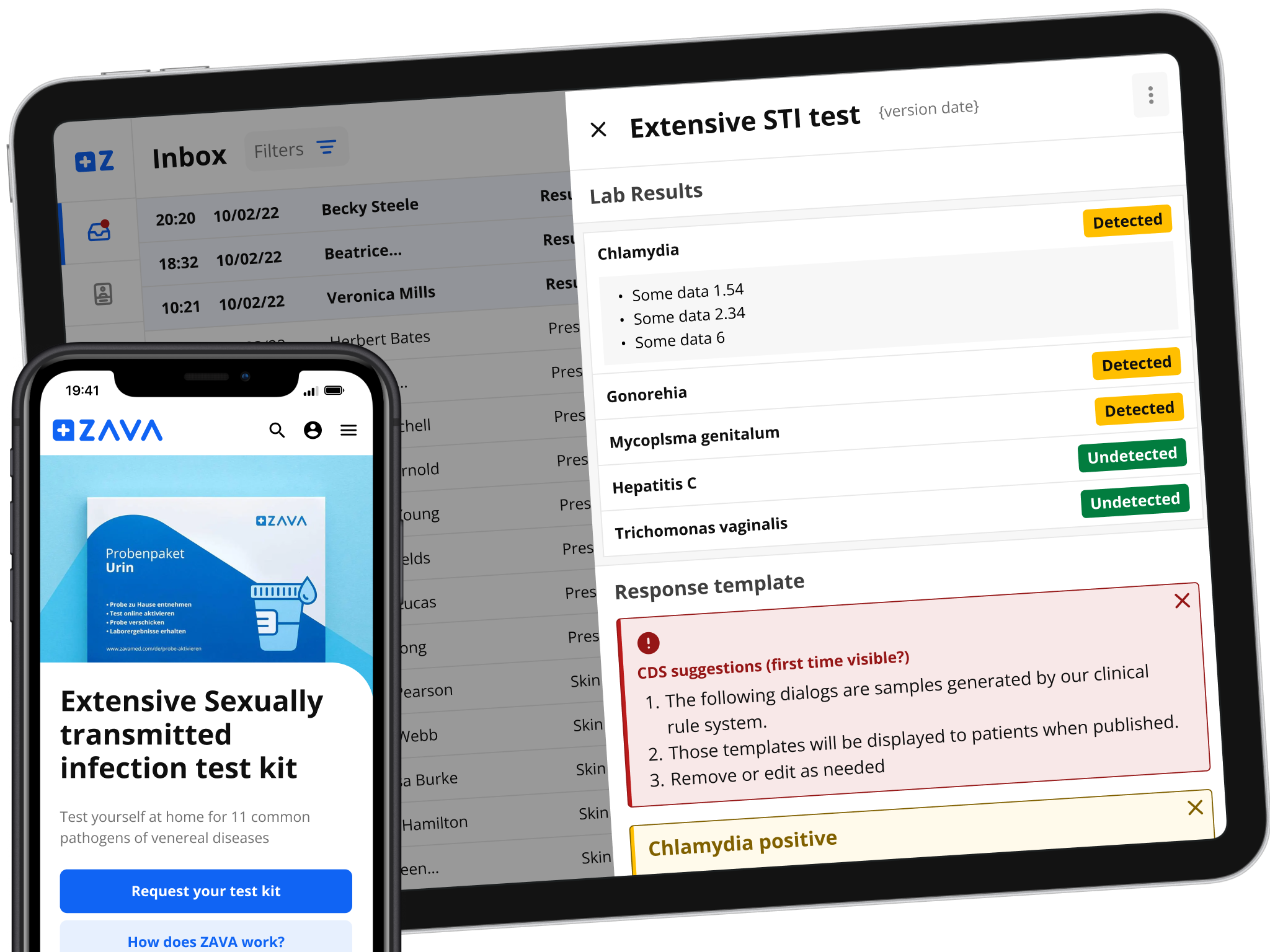
Testing: Leveraging UserTesting.com, we tested prototypes with target users to validate ease of use and clarify any confusing elements in the flow. We asked users to perform tasks like accessing test results, understanding the status of their test kit, and interpreting the results when available. This allowed us to address usability issues before launch.
4. Handling “Unhappy Paths”
After developing the blueprint, we organized sessions to identify potential failure points in both the patient and doctor journeys. We created “unhappy path” scenarios—cases where things could go wrong—and developed solutions for handling these situations. Ranking these scenarios by likelihood helped us prioritize which issues to address first, ensuring we focused on the most critical aspects of the service.
5. Story Mapping & Scaling
To plan the release, we created story maps for both patient and doctor experiences. These story maps allowed us to break the project into manageable phases, ensuring we could iterate quickly while keeping the long-term vision in mind.
This story mapping exercise also informed our user testing and prototyping cycles, enabling us to refine and scale the service iteratively.
Key Challenges
-
Tight Deadlines: Given the short timeline set by the commercial team, we had to make critical decisions on which features to prioritize for the initial release and which to plan for future updates.
-
Scalability: Designing a solution that not only worked for STI tests but could also support a wide range of tests and configurations based on various regulatory contexts required meticulous planning and flexibility in the design.
-
Limited UX Resources: With limited capacity in the UX team, we had to optimize collaboration across different departments and external partners to ensure all aspects of the service were covered.
Outcomes & Learnings
-
Business Success: The project successfully launched within the set deadline, and early metrics showed an increase in test kit orders, faster processing times, and positive results leading to treatment orders.
-
User Experience Improvements: The design improved the patient journey, providing a more intuitive and streamlined experience. For doctors, the new tools allowed for higher efficiency in processing test results and guiding patients toward recovery.
-
Learnings:
- Collaboration is Key: Cross-functional collaboration and constant communication were crucial in delivering a successful project. Working closely with content, dev, and commercial teams allowed us to iterate rapidly.
- Testing Matters: Areas that weren’t fully tested often caused issues post-launch. In future projects, a more comprehensive testing approach would mitigate this risk.
- Empathy for Internal Teams: Just as we empathize with users, we need to ensure that internal stakeholders are supported through clear documentation, prototypes, and communication.
Conclusion
The ZAVA self-testing service project not only improved the patient and doctor experience but also set the foundation for future growth. The iterative, user-centered approach allowed us to deliver a scalable and efficient service, despite significant constraints. The lessons learned from this project continue to inform how we tackle complex, multi-faceted design challenges.